The logo
The three-leaf sprout is the Sprout AAC logo and app icon. It works on light backgrounds as is. On dark or green backgrounds, give it a soft mint glow so the darker leaves stand out.
 On creamOn whiteOn green, with glow



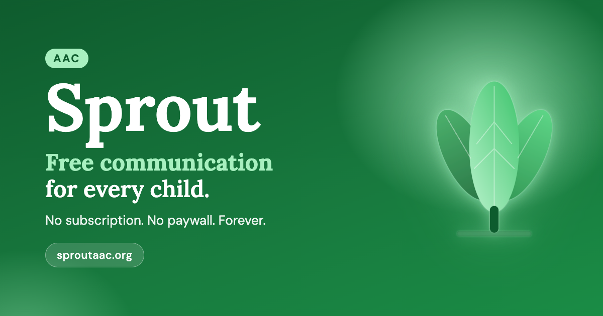
Every source file, including the app icon masters and social templates, is in our GitHub brand folder.
Using the logo
Two rules keep it looking right at any size.
Give it roomKeep clear space around the logo of at least half the width of the centre leaf. Don't crowd it with text or other logos.
Not too smallShow it at least 24px tall on screen, or 8mm in print. The only exception is browser favicons.
Please don't
Colour
Greens from the sprout itself, on a warm cream. Click a colour to copy its hex code.
Typography
Two free Google Fonts: a warm serif for headings, a friendly sans-serif for everything else.
Lora Bold (700) and SemiBold (600). Used for headings and the "Sprout" wordmark.
DM Sans Regular (400) to Bold (700). Used for body text, buttons, and the app's interface.
Name & voice
Write Sprout AAC on first mention, then just Sprout. We talk to parents, therapists, and teachers the way a good friend would: warm, plain, and honest.
We do
- Use plain language and explain any jargon, AAC included
- Focus on what children can do and say
- Say "children who communicate differently"
- Keep promises concrete: free, offline, no tracking
We don't
- Use pity or "suffering" language about children
- Call anyone "non-functional" or "low-functioning"
- Overpromise features that aren't built yet
- Use hype, urgency, or fear to make a point
Questions about using the brand, or need a format that isn't here? Email [email protected].